
01
My Background
As a multidisciplinary creative, I have navigated many realms within various creative industries, stretching my knowledge and broadening my skill set in such locations as NYC, LA, San Francisco, Istanbul, Geneva, and London. From writing, editing, and curating, content to producing and editing short films, interviews, and music videos, I have amassed a wealth of global experience — experience that endows me with versatility, adaptability, and hands-on savvy. Working as a creator and editor of words, images, graphics, and videos, I bring to the table 20 years of experience as a creative consultant well versed in aesthetics, music, film, and world cultures. Currently based between Geneva and Istanbul, I continue to pursue and explore the many felicitous intersections between various creative fields to develop innovative projects and produce timeless, memorable content.
Introduction
02
Approach
My Modus Operandi
An image-maker, wordsmith, video editor, and multimedia creator, I draw from my diverse experiences across numerous creative fields in order to deliver sophisticated and carefully considered content. Thanks to this holistic, integrated approach to conceiving, creating, and curating words and images, I produce polished content of uncompromising quality.
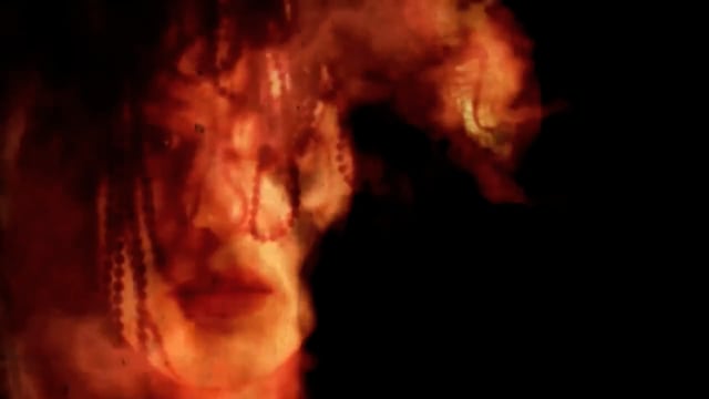
Music Video: "The Rose"
Original music: Thomas Bullock & Eddie Ruscha
Directed by Kateri O'Neil & Mary Rasmussen
Edited, animated, color corrected by Kateri O'Neil
Produced by Kateri O'Neil & Mary Rasmussen

Aesthetics & Visuals
With a B.A. and M.A. in Media and Communications, my creative practice includes photography, design, and typography. In addition to creating and editing videos, I have produced numerous photographic series and have designed editorial layouts, posters, packaging, digital graphics, and presentations. My keen eye for detail and consummate aesthetic sensibilities keep me committed to quality and consistency throughout my visual practices.
Please visit my Images page for more visuals.
Visions